For my redesign of Hardware and DIY materials such as paint I chose to look at Wilko's range of various interior and exterior paints, emulsions and spray paints.
These are the products I found:
As you can see there is little consistency across the range and despite being fairly clear to read and understand when studied separately like this, when all together on a shelf you can see how it would get confusing.
The function of these products is to signify: paint colour, product code and name, where it should be used, finish, size and the wilko brand as well as instructions such as drying time.
I held a small focus group to help decipher what people felt the order of importance for these pieces of information were:
- What is it?
- Colour
- Finish
- Size (litre)
- Colour code + Name
- Brand Name
The more important factors need to appear bigger and bolder and in this order on the tin (hyperbole) to aid buyers. Factors I could also include are pictograms and metonomy such as a leaf to signify that the paint is for outdoor use.
My aim is to create some form of a grid that would allow for consistency - improving the function of the tins whilst simultaneously making the form more trendy with a more modern and contemporary design.
ARTISTIC STYLE
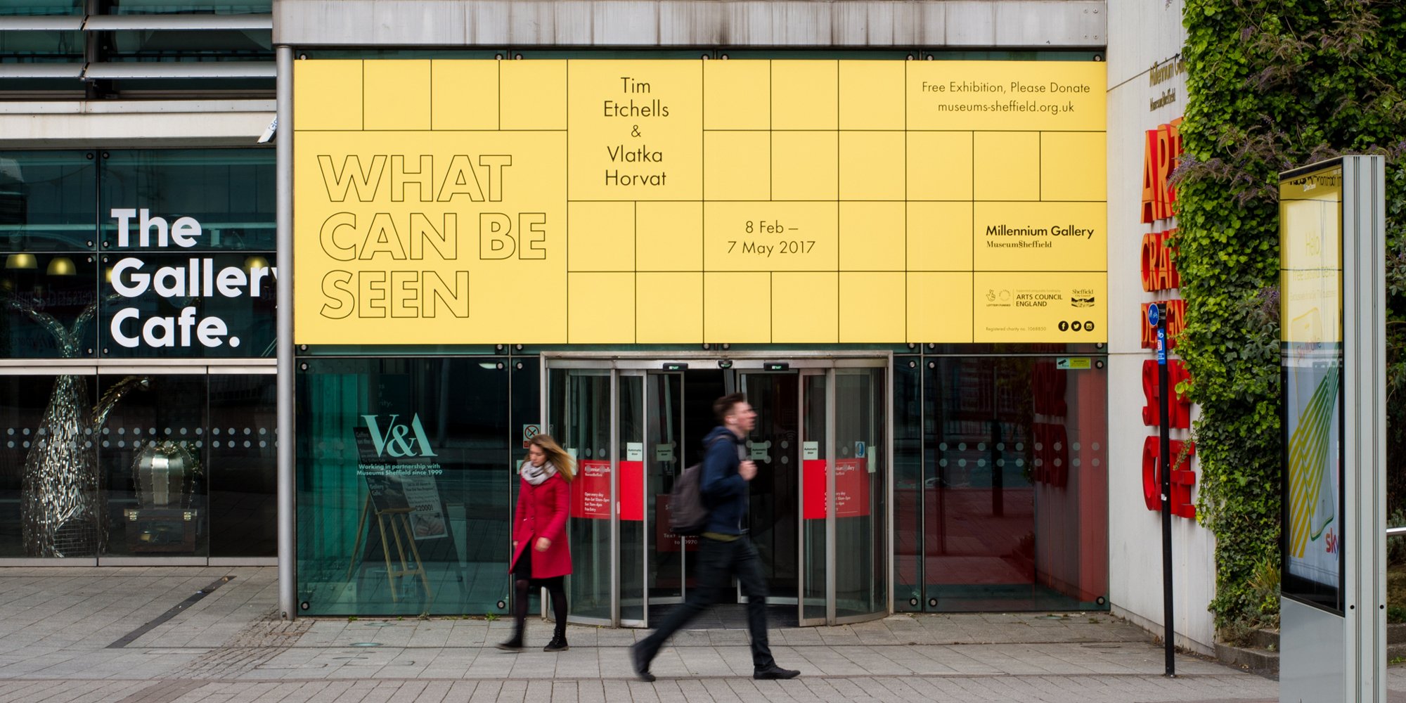
The style I am drawn towards is a current trend which I have seen emerging in lots of places which is an exposed grid pattern containing information such as type, colours and pictograms.
Leeds Food Fest Branding:
Exhibition Branding by Cafeteria for Sheffield Museum:
Menu design by Alphabet for a tea shop:
Soap Packaging:
Candle Packaging for Clark and Dumbo:

I really like this style as not only is it a structured way of conveying information but it looks very contemporary, modern and minimalistic aswell. The forms of the grids themselves also remind me of a range of DIY, and hardware inspired objects including the layout of the compartments in a toolbox, or the design of DIY model parts for toy cars and aeroplanes etc.
 |
| Grid shape in compartments of Toolbox |
 |
| Grid shape in DIY model parts |
Pantone charts are an interesting example of how something purely functional has become popular in terms of beauty and decoration. They are now a popular design on many things such as mugs, notebooks, and doors.
Their aesthetic is clear, neutral and bold. The layout, colour scheme and typography is iconic and appeals equally to both genders. The actual form of it is also very functional, clearly stating the referece number, colour and name, allowing for little confusion.
I sketched out a few ideas of how I wanted the labels to look and then in a crit decided on the most appropriate design:
Second down on the left was the most popular as it clearly displayed all the information on the paint tin in an order that would make looking for products at a glance easier. All of the type was horizontal, aiding legibility with the purpose of the paint (kitchen paint) being the key piece of information, with colour, finish and size being prioritised equally after that.
I then mocked up this format for the other varieties of paint I was redesigning for: kitchen paint, emulsion, spray paint and tester pot.
I then began to mock the designs up digitally in illustrator:
Added a border to the edge:
Typeface: OCR A Std
Typeface:
Main: FranklinGothic URW Comp Demi
Size: Baskerville Italic
Typeface:
Main: Courier Regular
Size: Baskerville Italic
Typeface:
Main: DIN Alternate Bold
Size: Baskerville Italic
I asked my peers to put a tally next to their favourite typeface and any additional reason why they liked or disliked the typefaces I had chosen.
OCR A Std was the most popular as although some found it too digital, most others preferred it as it was unusual and reminded them of DIY and wonky, clumsy shelves etc.
Someone also suggested that the subtle serif on some of the letters would help an older target audience find it more legible and easier to read. This increased legibility would also help buyers scan the shelves for the product they're looking for to pick out key words such as 'matt' or 'emulsion' from a busy shelf.


No comments:
Post a Comment