The use of sans serif typography contributes the contemporary feel of the visual language, accurately reflecting the progressive and cutting edge nature of the theatre.

As I was printing both digital and printed collateral I had to choose a could scheme that would work in both RGB and CMYK to avoid variations in the colour when it came to print the zine.
Using a duo tone colour scheme of #3f28c9 (Blue) and #ffcbdc (pink) then converting to CMYK creates this colour scheme. When applied on top of colourplan ‘Lavender’ paper (for printed collateral) it creates a bold and memorable design that will help the HUB stand out against similar organisations and events in the area such as The Grand, West Yorkshire Playhouse and Leeds City Variety.
Inspired by the history of the HUB’s location, the colour scheme of the visual identity is informed by a strong rational behind the design which will help determine its longevity. This is what Paula Scher described as a ‘sensibility’ (2017).

Grid
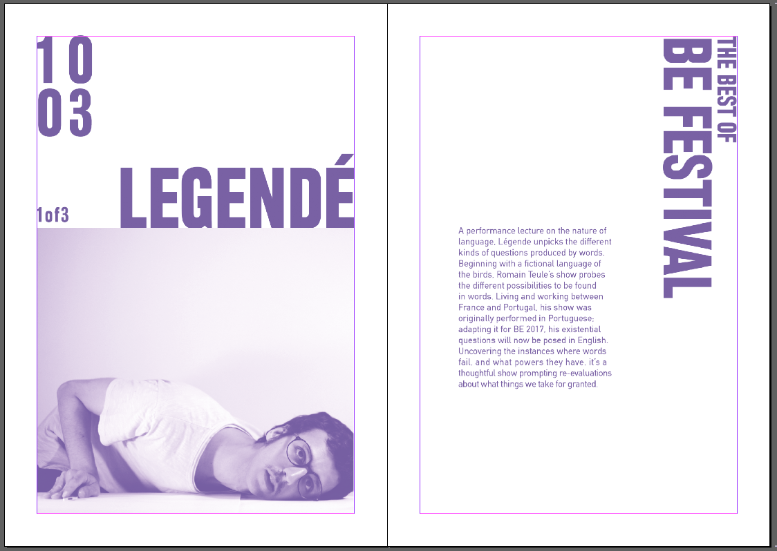
Referring to the work of Paula Scher and her design for MoMA I implemented a strong yet flexible grid in the design of the zine. However, to stay in keeping with the laid back nature of the HUB I made the layout of the Zine as playful and variable as possible, experimenting with the positioning of both the images and text, with only the date staying in a fixed position in either of the top corners.
 |
| Sketch of the grid |


I wanted the fact that the HUB was pay as you decide to be a stand out feature of the design so created a mini booklet that not only drew additional attention to the zine but also to this unique payment policy the HUB implemented. This tiny booklet slots into a slit on the front cover.

Images of the Zine when printed:


I love how the colours came out when printed on the paper and am really happy with how the type and layout work with the duotone images! So pleased overall.
No comments:
Post a Comment