Monday, March 27, 2017

OUGD501 - SB2. - Research, Development & Experimentation

PRODUCTS

For my redesign of Hardware and DIY materials such as paint I chose to look at Wilko's range of various interior and exterior paints, emulsions and spray paints. 

These are the products I found: 


As you can see there is little consistency across the range and despite being fairly clear to read and understand when studied separately like this, when all together on a shelf you can see how it would get confusing. 

The function of these products is to signify: paint colour, product code and name, where it should be used, finish, size and the wilko brand as well as instructions such as drying time.

I held a small focus group to help decipher what people felt the order of importance for these pieces of information were: 

  1. What is it? 
  2. Colour
  3. Finish
  4. Size (litre)
  5. Colour code + Name
  6. Brand Name
The more important factors need to appear bigger and bolder and in this order on the tin (hyperbole) to aid buyers. Factors I could also include are pictograms and metonomy such as a leaf to signify that the paint is for outdoor use. 


My aim is to create some form of a grid that would allow for consistency - improving the function of the tins whilst simultaneously making the form more trendy with a more modern and contemporary design.  

ARTISTIC STYLE

The style I am drawn towards is a current trend which I have seen emerging in lots of places which is an exposed grid pattern containing information such as type, colours and pictograms. 

Leeds Food Fest Branding:


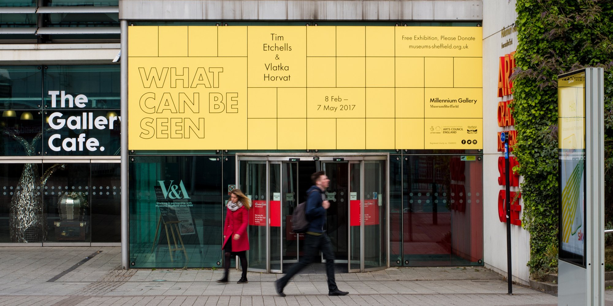
Exhibition Branding by Cafeteria for Sheffield Museum:


Menu design by Alphabet for a tea shop: 


Soap Packaging: 


Candle Packaging for Clark and Dumbo:


I really like this style as not only is it a structured way of conveying information but it looks very contemporary, modern and minimalistic aswell. The forms of the grids themselves also remind me of a range of DIY, and hardware inspired objects including the layout of the compartments in a toolbox, or the design of DIY model parts for toy cars and aeroplanes etc. 


Grid shape in compartments of Toolbox
Grid shape in DIY model parts
Pantone charts are an interesting example of how something purely functional has become popular in terms of beauty and decoration. They are now a popular design on many things such as mugs, notebooks, and doors. 


Their aesthetic is clear, neutral and bold. The layout, colour scheme and typography is iconic and appeals equally to both genders. The actual form of it is also very functional, clearly stating the referece number, colour and name, allowing for little confusion.

I sketched out a few ideas of how I wanted the labels to look and then in a crit decided on the most appropriate design: 


Second down on the left was the most popular as it clearly displayed all the information on the paint tin in an order that would make looking for products at a glance easier. All of the type was horizontal, aiding legibility with the purpose of the paint (kitchen paint) being the key piece of information, with colour, finish and size being prioritised equally after that. 

I then mocked up this format for the other varieties of paint I was redesigning for: kitchen paint, emulsion, spray paint and tester pot. 


I then began to mock the designs up digitally in illustrator: 


Added a border to the edge: 

Typeface: OCR A Std


Typeface: 

Main: FranklinGothic URW Comp Demi
Size: Baskerville Italic 


Typeface: 

Main: Courier Regular
Size: Baskerville Italic


Typeface: 

Main: DIN Alternate Bold
Size: Baskerville Italic


I asked my peers to put a tally next to their favourite typeface and any additional reason why they liked or disliked the typefaces I had chosen. 


OCR A Std was the most popular as although some found it too digital, most others preferred it as it was unusual and reminded them of DIY and wonky, clumsy shelves etc. 

Someone also suggested that the subtle serif on some of the letters would help an older target audience find it more legible and easier to read. This increased legibility would also help buyers scan the shelves for the product they're looking for to pick out key words such as 'matt' or 'emulsion' from a busy shelf. 

OUGD501 - Study Task 09 - SB2 - 6. Outcomes / 7. Production, distribution and reception Page

Outcomes / evaluating results (1 A3 design sheet)

Evidence of your final outcome/solution. You must critically explain / justify your solution in reference to the brief / audience. You must also explain how your final solution relates to your critical writing/research using at least 3 references.


I have taken an item of packaging that is typically considered as purely functional and redesigned it so that I have not only enhanced the function / purpose of the packaging, but simultaneously created a more aesthetically desirable product than it’s competitors on the market.

There is now a lot more consistency across the range allowing you to quickly scan the labels for the product you’re searching for and easily compare differences such as it’s finish, colour and size etc.

The neutral colour palette of the design now appropriately reflects the even split between a male and female demographic and the legible yet contemporary typeface makes the information on the packaging accessible to consumers of all ages.

Although traditionally a digital font, OCR A std has a slight serif which is proven to increase legibility, something I thought would be useful for the more elderly audience and finding products at a glance. It also created an unusual modern look which my peers liked and was somewhat reminiscent of wonky DIY shelving.

In my essay I explored the work of Dieter Rams and how he set out to reduce clutter and wastage by creating designs that were viewed as essential and reduced to the minimal. Using Ram’s ‘less is better’ approach this is something I have achieved in the design, with the form of the packaging evolving through its function.

However as both Mother Ann Lee and Keiko Ueki discussed, I have avoided making ‘a simple product for the sake of simplicity’ (Ueki) and instead considered ‘the holistic forces of the project, audience needs, client desires, ethical obligations, aesthetic inclinations, material properties cultural presuppositions, and yes, functional requirements.’(Mother Ann Lee) To produce a piece of packaging that is both stylish and functional.

Production / Distribution / Reception:

Production and distribution considerations (3 A3 design sheet)

Outline, justify and explain production methods and considerations. Consider how production methods interact with communication. Outline, justify and explain distribution considerations - how will your design be distributed to best attract the right audience? You must also demonstrate an awareness of how your designs will be received by your target audience - this may mean "testing" your work in context or talking to audience members in a focus group, for example.


Production

In regards of production methods, all materials used would be ethically sourced and sustainably produced. The function of a piece of packaging of this nature is to store and transport the product -in this case, paint - keep it safe and fresh and then once used be discarded of. Through my research I found that lots of current paint pots, particularly the plastic ones are non-recyclable.


‘At the moment, plastic paint cans can’t widely be recycled, however your local household waste recycling centre will accept these and make sure that they’re disposed of responsibly.

At B&Q, we currently support a pilot scheme to introduce recycling for these containers, so that hopefully all plastic paint pots can be recycled in the future.’
- B&Q

Therefore I would make the pots from metal or a plastic that is widely recycled, so that no waste goes to landfill. 
The inks on the packaging would also be non toxic and the labels themselves would be made of either dissolvable, plantable or biodegradable material.

Distribution

The range of paints will be distributed in Wilkinson stores across the nation with the potential to establish the brand as a cheaper alternative to popular makes such as Dulux, Farrow & Ball and Ronseal. It could then be sold in DIY stores such as B&Q and independent privately owned hardware stores.

It will also be advertised online to attract a younger generation of buyers who first look on the internet for reviews before going out to buy products in-store, as my initial research found. 

Friday, March 24, 2017

OUGD501 - Studio Brief 2 - Study Task 08 - Pitching your ideas / Developments Page

You should talk through each of your solutions in detail explaining a) how each resolves the design problem, b) your design decisions, c) material/production considerations and d) any distribution considerations:

Solution 1:

Thinking back to my theoretical research I considered ways in which packaging could be stripped back to the bare minimum to not only make it less confusing but also create less waste once the package was disposed of, enhancing its function.

Both Dieter Rams and Antoine de Saint-Exupery practice a similar mantra stating ‘A designer knows he has achieved perfection not when there is nothing left to add, but when there is nothing left to take away.’ Making usability a key design consideration.

When there is less distracting clutter on the packaging it allows the product to speak for itself, and for the consumer to make a clear and informed decision.

The packaging would be made of a biodgeradable and ethically sourced material with the potential to use plantable packaging which embeds seeds in the fibers of the material. 

The products would then be sold in a wide range of large-scale hardware stores such as B&Q, independent hardware stores, online and in various other outlets where you would typically find tools of this nature.


Feedback: This idea links well with my essay question and that it would be an interesting concept to explore seeing how far a product's packaging could be reduced down to. Some feedback I got was that excess packaging such as the plastic packaging around scissors is also functional as it protects children from potentially sharp and dangerous objects. Therefore I would have to be cautious with the adjustments I made to ensure the package was still fully functional for all it's purposes.

Solution 2:

A second approach of marrying form and function together would be to make the package functional in itself once it no longer contained a product. Similar to the TV package/stand by Tom Ballhatchet which I explored in my essay.

The packaging could either be kept and used as further storage in the workspace for items such as screws, clips and nails, or repurposed and used for a completely different item.

The initial packaging would have to be durable to withstand such use and would also rely heavily on the materials used rather than the actual design of the pack. 

The distribution of these products would be sold in a wide range of large-scale hardware stores such as B&Q, independent hardware stores, online and in various other outlets where you would typically find products of this nature.


Feedback: The feedback I received from this approach was that it also links well with my essay however it might be harder to pinpoint the type of packaging that every separate individual would want to keep as some people wouldn't want to clutter up their homes, whereas others would form some sort of subjective emotional attachment to it eg. they liked the colour / had something in mind which they could keep in it. Therefore pinpointing and understanding the desired target audience would be more difficult for this idea.

Solution 3:

My third idea considers usability combined with form and the experiment conducted by Japanese researches Masaaki Korosu and Kaori Kashimura on the two identically functioning ATM machines. Taking content from an existing line of paint tins and other hardware products, redesign them so that it is easier to read, understand and compare with other competing products on the shelf.

When you go to buy a tin of paint, often you already know which product you want to purchase: the shade, the finish, the size. However finding it can be a challenge. Creating consistency between designs by incorporating a grid system and sticking to it will create a range that is easy to understand and use, ultimately improving the function of it as well as the form. 

In regards of production methods, all materials used would be ethically sourced and sustainably produced.

My research showed that DIYers are exceptionally green-conscious. They are looking to purchase products that are created ethically, sustainably and possibly offer benefits to underprivileged communities or people groups.

The function of a piece of packaging of this nature is to store and transport the product -in this case, paint - keep it safe and fresh and then once used be discarded of. Through my research I found that lots of current paint pots, particularly the plastic ones are non-recyclable.

‘At the moment, plastic paint cans can’t widely be recycled, however your local household waste recycling centre will accept these and make sure that they’re disposed of responsibly.

At B&Q, we currently support a pilot scheme to introduce recycling for these containers, so that hopefully all plastic paint pots can be recycled in the future.’ -
B&Q

Therefore I would make the pots from a metal or a plastic that is widely recycled, so that no waste goes to landfill. The inks on the packaging would also be non toxic and the labels themselves would be made of either dissolvable, plantable or biodegradable material.

The products would be sold in a wide range of large-scale hardware stores such as B&Q, independent hardware stores, online and in various other outlets where you would typically find tools of this nature.


Feedback: This idea has the potential to create a larger range of outcomes and explore a number of design approaches to make something which is both functional and nice to look at. It would be interesting to see how you could make a product like this stylish and appeal to a larger target audience.

Chosen Idea:

Prototype 3 is the one I am taking forward as it has the biggest potential for a variety of experimentation and exploration of a range of products, and consequential forms.

Taking inspiration from a number of DIY, and hardware inspired objects and tools I hope to create an informed range of packaging that makes DIY projects easier for everyone and the packaging representative of the entire demographic it appeals to, not just males between the ages of 25-35.

As we have established that people who take part in DIY are an even split between males and females and all ages, the packaging has to be as neutral as possible while enhancing the products to their maximum potential.

Investigation: Key Points
Which is more important, form or function?
Does improving the form of something (making it more trendy/ eyecatching / aesthetically pleasing) improve the function?
Can something be equally functional and aesthetically pleasing?
What do consumers want?
Could you make a range? Would this make it more functional?
Use of textures / different materials to help
Use of technology to work alongside products, keep a record of what you've used

Problem: 

Identifying functions of packaging, eg. environmentally friendly, sturdy etc.
Design/ imagery/ message can be accepted by one audience but may be rejected by another
Problems with the appropriateness of design

Solution:

Design a piece of packaging that is both aesthetically pleasing to look at, trendy, modern, covetable that is also more functional than any other designs on the market. (Hardware store packaging?)
My essay focused on the relationship between form and function in packaging design and how the form of an object can provoke an emotional and neurological response from the user and so an obvious practical response would be to produce something that combines functionality with beauty. 

Idea - to create new packaging design informed by research from essay
Through my research, I found a lot of examples that had already been made that looked at this idea.

Wednesday, March 22, 2017

OUGD501 - SB2. - Relevant Examples of Packaging Design

I created a pinterest board which featured a range of packaging designs relevant to the themes I explored in my essay. It featured designs which I considered to be highly functional as well as aesthetically pleasing. A few examples include:

Dimitris huile d olive


Studio Kluif


Evgeniy Pelin


Mikyoung Jeong

Tuesday, March 21, 2017

OUGD501 - Study Task 07 - SB2 - 3. Idea generation + prototypes Page

Task: Idea Generation

Deliverables

1 x design sheet demonstrating a range of initial ideas 

3 x design sheets visualising 3 different solutions to your brief


Content

Idea generation / material considerations (1 A3 design sheet)

Requirements: Produce at least 20 rough ideas/scamp/thumbnail solutions to the problem. Where applicable your ideas should be accompanied by necessary material considerations (production methods, medium, scale, etc.) including a discussion of the impact of material decisions.

Research considerations / justifications: 
  • Stock
  • Print
  • Binding
  • Colour
  • Images
  • Typography
  • Principles (functional, rational, expressive, modernist / postmoddernist, hierachy)
  • Audience (Socio-economic, gender, age, race, etc.)
  • User Experience
  • Usability
  • Canons
Prototype solutions:

3 x graphic prototypes (3 proposed solutions) (3 A3 design sheets)

Requirements:

3 x proposed solutions derived from idea generation stage. Visualisations can be fairly rough at this stage but they must be accompanied by an explanation/justification in reference to the original problem/brief. At this stage it will be necessary to seek feedback on your proposed ideas from peers and tutors. Feedback will help to direct your developments.

Mandatory Requirements


You must show that you are aware of the role of contextual awareness and research within the idea generation and proposal stage of the design process. You must show that your ideas are informed both by the nature of the brief and your developing knowledge of design in general.


Thumbnail Sketches


I sketched out a variety of different ideas that had the potential to explore the relationship between the function of a piece of packaging and it’s form. 


Concepts I played around with included stripping back packaging to the bare minimum or creating packaging that could be reused, repurposed or recycled easier. I also considered creating packaging which was not only beautiful to look at in it’s own right such as Mikyoung Jeong’s tool packaging, but enhanced the product itself by allowing the consumer to view it better. 

Concept 1: Take a piece of packaging which is ugly yet functional such as a tin of paint and make it aesthetically pleasing, researching current trends, whilst simultaneously making the design easier to understand and use. 


Feedback: This would be an interesting approach as many DIY packaging solutions don't really consider current trends in design and are usually purely functional. They can be difficult to understand. A well laid out tin considering typography, colour and layout would improve both functionality and form.

Linking back to essay: A lot of my essay explores the way in which the aesthetics of a product can affect the usability.

Ideas - Research Dulux and Farrow and Ball Paint tins and look at product, range and distribution. Look at the order of how things are read. Prioritizing the most important information.

It is important to understand the target audience of who would be buying the paint tin as you wouldn't want the packaging to act as a deterrent from that brand.

Concept 2: Redesign a range of packaging such as Dulux so it has fleuncy across it's range making it easier to use and understand. so that it enhances the ethos of the product within and becomes more timeless. 

Feedback: This would be interesting to explore and would relate back to Catherine Jansson-Boyd as the packaging itself would emulate the product and how the consumer sees themselves.

Look into different ways of how packaging can be environmentally friendly and sustainable.

Concept 3: Re-Design a piece of packaging so that people want to keep it and reuse it for a different purpose, exploring why some people keep hold of packaging, eg. you like how it looks and want to keep hold of it. 


May be hard to think of target audience as different people have different emotional attachments to different objects.

People only tend to keep hold of packaging that is personal to them.


After feedback I began to understand that concept one had the most potential and was the better concept because of how this relates directly to my essay. It implements the idea that if something is designed more beautifully it can become easier to understand and use, therefore enhancing the role of the product packaging eg. it's function. This would back up my reading and prove that When something looks nice or is aesthetically pleasing it makes us feel good which in turn allows us to think more creatively. This in turn makes products easier for us to use and understand as people find solutions to the problems they encounter more quickly. (Spillers, F. 2004)


Practically investigating the relationship between Form and Function in packaging design.