Monday, January 22, 2018

OUGD601 - Evaluation

My aim for this project was to gain an understanding of the role branding and visual identity played within cultural institutions and the subsequential effects establishing a strong visual identity can have on institutions such as art galleries, theatres and museums. Before starting the project I assumed there would only be possitive side effects from establishing a strong visual identity such as increasing visitor numbers and the popularity of the institution. However, after conducting research for the written essay I learnt there was a strong counter-argument, with visual identities having the potential to diminish the true values of an institution, causing it to become limited to its branding and a projecting on singular message 'An attitude has emerged that values the projection of the image of the institution over and above communicating the peculiarities of its particular activities, from which its essence was drawn in the first place' (Bell, 2004). I found writing the essay a lot more challenging this year than I did last year and had to go back and change it a lot more than I had originally planned to create a balanced and fully explored argument. Theories such as Adorno and Horkheimer's on identity and the culture industry and Jameson's on semiotics were difficult to get my head around at first but once I had they became a key part of my essay. If I had more time (or a bigger word count) I would have tried to incorporate some more theories relating to identity design and branding into my essay.

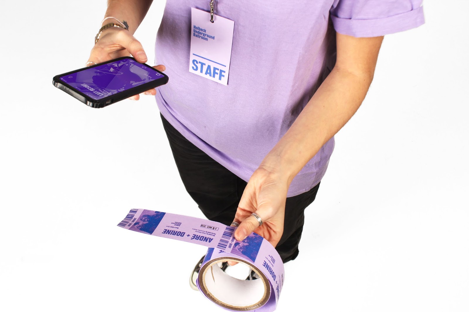
Regarding the practical I am glad I changed my idea last minute to do a redesign for the Holbeck Underground Ballroom as it gave me an opportunity to create the visual identity from scratch, giving me creative freedom to apply everything I had written about in the essay, without the need to consider or be influenced by any pre-existing guidelines. That being said if I could have started the practical sooner, I would have liked to develop the visual identity further into environmental graphics such as wayfinding and street art, however, restricted by the time I wasn't able to do that. Unfortunately, I never saw the inside of the HUB as the Spring Season doesn't start until February and it has been closed all winter.

I'm still happy with the practical outcomes I designed as I effectively created a consistent visual identity that worked well across both printed, digital and promotional materials, as was discussed in my essay. I believe I have created a strong synthesis between the practical work and the essay referring to various designers and their principles across my design boards.

In terms of what I could have improved or explored further throughout this project, it would have been beneficial to get answers to the questions I emailed Apfel studio, the designers behind the Hepworth's visual identity on their opinions of the effects visual identity have on cultural institutions. However, I should have emailed a range of studios rather than putting all my eggs in one basket, to get a more diverse range of opinions.
I didn't do a questionnaire or test my design at the end of this project like I usually do for COP as I had done a number of crits throughout the process to determine the best route to take my designs. As the HUB had no visual identity system to begin with it wasn't a case of asking 'which do you prefer? Before or after?' as there was nothing to compare it to, so any outcome I created would have been an improvement.

Overall this final module for context of practice has really pushed me to the limit and tested my skills both in terms of writing, analysis, synthesising, conducting and extracting relevant research and designing an appropriate outcome. The overall content has been researched, developed and carried out to a standard I am proud of, with the constant feedback from my tutors and peers to ensure the project was going in the right direction. My final outcome demonstrates a range of collateral that is consistent and works effectively across both print and digital media, supported by an extensive body of research and development that builds upon the theoretical explorations of the written piece.

Saturday, January 20, 2018

OUGD601 - Synthesising Document

The practical side of my project physically embodies the breadth of knowledge I learnt through researching and writing my essay, applying my findings and expressing them visually in the design of a new visual identity for Holbeck Underground Ballroom – the HUB. As the HUB had virtually no visual identity to begin with it gave me the perfect opportunity to start on a clean slate, giving me complete freedom to apply the theories relating to what makes a successful visual identity at every stage of the project.

In my essay I discovered that designing for a cultural institution wasn’t as straightforward as designing the visual identity for more commercial products and services as they represented a range of constantly evolving programmes, exhibitions and performances that showcase what Tom Bell (2002) describes as ‘profuse variety in both content and its interpretation’. Bell argued that when creating the identity for a cultural institution the designers must have its content such as it’s programming and performances at the forefront of their designs, as failing to do this could cause a singular branded message to take over and obscure the institution's true contents.

Drawing from this, I used bold, eye-catching images of each performance as the focal point for each design across both the printed and digital collateral, ensuring that the variety in performances was showcased at every aspect of the identity including the front cover of the booklet and the landing page of the website and app.

The purple colour scheme which runs consistently across the collateral was inspired by the local history of Holbeck and the location on which the HUB stands, once famously known as the Lavender, a local public house whose landlord and landlady had an openly ‘lavender’ marriage. It was also the first gay pub in Leeds. By building on an interesting and unique fact about the HUB’s history I created a strong rationale behind my design, which as I discussed in the essay, is an important factor in determining the success and longevity of a cultural institution’s visual identity. The colour scheme I used is also fairly uncommon in the design of promotional materials for institutions like the HUB, meaning my design would be very easily recognisable and memorable when applied in context amongst a pile of other gig posters for example.

Consistency is another key factor in identity design as it creates what the designer Sean Perkins (2013) calls "a strong, simple identifier that can imbue subliminal qualities of strength, security, trust and assurance." As the HUB currently has no branding at all, to an outsider visiting their website for the first time, the institution doesn’t seem very trustworthy or reliable. Therefore, some visitors may be put off visiting as there is no visual consistency. By applying the same typefaces, colour scheme and tone of voice across both the digital and printed collateral I have created a visual language that looks trustworthy and reliable, without overshadowing the true content of the institution.

Considering both modernist and contemporary design principles, similar to Paula Scher’s redesign of MoMA’s visual identity, I implemented a strong yet flexible grid across the entire range of the HUB’s collateral. However, to stay in keeping with the laid-back nature of the HUB I made the layout of the Zine as playful and variable as possible, experimenting with the positioning of both the images and text, with only the date staying in a fixed position in either of the top corners. To increase recognisability of the HUB, when used on promotional posters and flyers I used a consistent layout, only changing the information and the picture. I experimented with the use of an expressive logo for the majority of the project, to symbolise theatre being turned on its head; however, in the final designs, I believed the combination of a consistent typeface, colour scheme and duotone images was strong enough to be used without a logo, similar to the approach used by the Baltic.

An extract in my essay from the designer Adrian Shaughnessy stated that: ‘...good visual branding is honest, graphically expressive and highly memorable. It should be optically sophisticated (not muddled or over-cooked) and it should work in print, digital and broadcast settings.’ (Shaughnessy, 2015) I believe I have achieved all of these factors in my design for Holbeck Underground Ballroom.

Friday, January 19, 2018

OUGD601 - Time Plan


OUGD601 - Practical - Finished Outcomes


OUGD601 - Practical - Digital Collateral - App

Wireframe sketches for App


The Hub has a pay what you decide policy, meaning the audience pays what they think the show is worth after the perfromance.

Some audience members could find this embarrassing and awkward which is against HUB’s aim to be friendly and welcoming. To eliminate this problem the app features an an anoymous payment system which allows you to instantly transfer money to the performer.

OUGD601 - Practical - Digital Collateral - Website

Wireframe sketch for website:


Content for Website

Home
What's On?
About Us
Contact
Find Us

About Us

Holbeck Underground Ballroom, otherwise known as the Hub is Yorkshire's most unique theatre space, presenting cutting edge perofrmances from accross the UK. Situated underneath three disused railway arches, the HUB warmly welcomes everyone from seasoned theatre goers to people wanting to experience theatre for the first time. All our performances are pay what you decide giving everyone the opportunity to experience radical touring work from accross the UK in our fantastic venue.

Flick through performance


Original designs for website:


Revised design for website:

After a crit, I reviewed the purpose of the website and the nature of the HUB and decided that the only information needed to be displayed online was the list of shows performing there that particular season - in this case Spring, and an about page which also had the address and phone number of the venue.

The navigation needed to be kept as simple as possible. There are only 10 performances on this season so the landing page would be in the format of a slide show, allowing the viewer to flick through the shows quickly, reading a brief overview of each performance
and the date it was on, again keeping costs to a minimum.


3rd revision for website:

When displaying the information for each performance I tested a few different UI’s, one with a pop up window that you could open and close down (above) and one with the information always visible. I decided the latter was most appropriate as when quickly browsing performances, opening and closing windows would become annoying.


Final Solutions:

In the essay I discovered how good visual branding works seamlessly accross both print and digital media, as Sean Perkins states: ‘It should be optically sophisticated (not muddled or over-cooked) and it should work in print, digital and broadcast settings.’

Therefore when creating my digital design I tried to make it as similar to the printed collateral as possible.

The website features the current season’s performances in a looping slideshow format, allowing site visitors to quickly flick through and browse what’s on without having to click off the landing page. Each slide contains a brief overview of each performance and the date it’s on, with the option to save a seat if you like the look of the performance. The simplicity of the site also keeps production costs to a minimum.